 Perfect
www.birmingham.gov.uk Alpha project - Images of Birmingham on the home page
simon gray — 2013-02-13, 17:43:08Back in late September 2012, as part of my work at Birmingham City Council, I instigated and led on a programme of incremental improvements to the council's website, blogging about the ideas and progress along the way, taking inspiration from Shropshire Council's Project WIP and the Government Digital Service work on www.gov.uk. The site on which I blogged has been taken down now, but I thought it worth reposting the more broad-reaching content from it here.
One of the issues which has caused a fair amount of discussion amongst colleagues internally is the matter of images of Birmingham on the home page.
There’s a strong view that as well as being a gateway to the services the website and the council as a whole offers, the home page should be used to market Birmingham the city, particularly by means of having pictures of Birmingham on the home page.
We’re not automatically opposed to this idea on principle – but we are indeed unsure about it as a direction to go in, partly because we want to ensure the home page is as focussed and uncluttered as possible, and partly because we don’t think people come to the council website with a particular interest in looking at pictures of the city; residents will already know what the city looks like, and visitors and potential visitors will always find a richer source of imagery of the city from sites such as Flickr.
There’s also the more pragmatic question of what images to use to promote the city? Selfridges has been a favourite iconic image since it opened here in 2003, but 10 years on it’s perhaps time to think of other iconic images. The Council House is another oft-used image by ourselves – but fine building as it is, is the organisational centre of the civic administration the best image to use to promote the city as a whole? We like to promote our canals in Birmingham, but actually there aren’t many canal vantage points which are both highly photogenic and at the same time clearly uniquely Birmingham rather than canals anywhere.
We’re all getting quite excited about the opening of the new Library of Birmingham this coming September, so we’ve chosen to use a highly de-saturated image of the building’s cladding as a background image windowed across the home page’s six segmentation boxes.
Looking at other councils’ websites, I picked a random sample of six different home pages and was surprised to see actually none of them featured images of their localities:
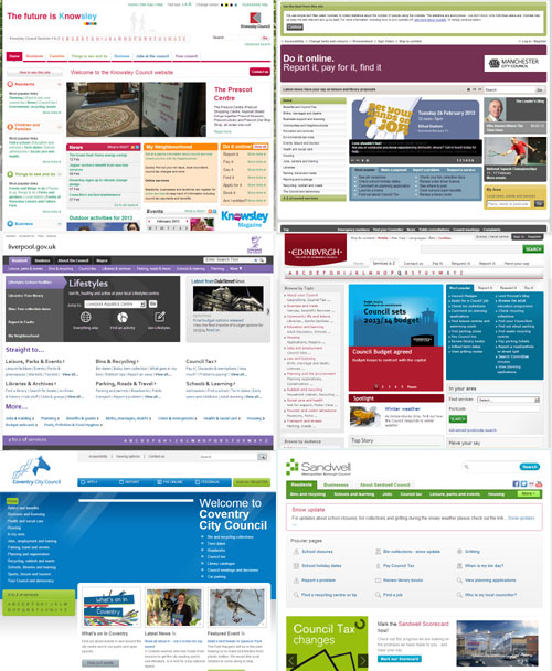
- http://www.knowsley.gov.uk/
- http://www.manchester.gov.uk/
- http://www.liverpool.gov.uk/
- http://www.edinburgh.gov.uk/
- http://www.coventry.gov.uk/
- http://www.sandwell.gov.uk/
Comments from original article
-
Daz Wright says:
February 19, 2013 at 10:58 am
I’m not a big fan of putting images on the front page. I don’t think people will stumble across the site and decide to visit/invest in Birmingham based on images.
There is a great advantage in ensuring that the entry page is devoted to function. This is a page that we will expect residents to visit many times if this is going to be their principle channel for engaging with the Council.
-
Stuart Lester says:
February 19, 2013 at 8:43 pm
I guess from a residents perspective you want to get to the information you need fast, so images not needed. Having said that I wonder if people outside fo Birmingham would prefer a “prettier” introduction page.
I would try to understand the distribution of current users of the website and apply a bit of guess work as to what they want from the site.
Alternatively pick up their location and adapt the front page accordingly (if it is possible to pick up html5 geolocation form the final solution?).
Images with news items can cover both cases, makng the iste look less bland and drawing the eye to the news item.
-
Simon Gray says:
February 20, 2013 at 10:08 am
A responsive solution – interesting! There’s no reason why it shouldn’t be technically possible in the final solution, although I wonder if people might get irritated by the browser asking them if they agree to share their location when they arrive on the page?
-
-
Marc says:
February 20, 2013 at 3:39 pm
Have you considered using a large background image? If done correctly is doesn’t interfere with the UI for residents but can ‘sell’ your city.
See to http://www.devon.gov.uk/ or http://www.scambs.gov.uk/
-
February 20, 2013 at 4:27 pm
They’re both good examples, yes, and represent quite nice, ‘clean’ designs also.
I think if we were to go in this direction, an image of Edgbaston Reservoir might be a good choice.
-
-
Colin Stenning says:
February 20, 2013 at 7:06 pm
A sense of place and locality are important. Websites are visited by people from all over the world who are curious to find out where somewhere looks like – even if there is no desire to visit. A Council website should focus on service delivery, but should it be devoid of images? I think a happy balance is more important…
-
Victor says:
May 14, 2013 at 8:45 am
The choice of six screengrabs is very interesting as they all look pretty much the same.
I’d love to know your thoughts on a site such as Manchester’s.
I am not one for always comparing Birmingham to Manchester, but their site “gets it”. No clutter, simple, obvious, and a lot more likely to achieve channel shift than anything else Birmingham is trying to do.
Has any consideration been given to buying something “off the shelf”, or at least cloning what they do? It is even cleaner and simpler than the Government’s decentish efforts to reform the web!
I just fear this is another reinventing the wheel exercise, that will leave BCC with egg on its face, as the 2009 “revamp” did.
Cut the jargon and nonsense pages, use simple clear logos, order them in priority based on proven demand, and we will have a site to be proud of.
-
Interesting comments about home page design generally from Jakob Nielsen – http://www.nngroup.com/articles/homepage-real-estate-allocation/