 Perfect
www.birmingham.gov.uk Alpha project - User testing customer journeys – it’s not just about the top tasks
simon gray — 2013-05-24, 15:38:23Back in late September 2012, as part of my work at Birmingham City Council, I instigated and led on a programme of incremental improvements to the council's website, blogging about the ideas and progress along the way, taking inspiration from Shropshire Council's Project WIP and the Government Digital Service work on www.gov.uk. The site on which I blogged has been taken down now, but I thought it worth reposting the more broad-reaching content from it here.
When designing a new website, especially when proposing a radically new menu system (‘information architecture‘), it’s important to test with one’s potential users that the design and navigation proposed actually works.
There are many pairs of pliers in the usability tester’s toolbox to help them with this – card sorting exercises for navigation, eye tracking studies for layout, unstructured sessions with or without interviews to get a gut feeling for the level of success and/or to look out for potential problems outside the planned testing, and the setting of specific tasks to test participants to establish (a) if they can complete them at all, and (b) how easy it was for them, what their ‘customer journey’ through the site to task completion was.
The prevailing wisdom in the Local Government digital community, as pioneered by Socitm, is the Top Tasks Methodology – whereby using your access and search statistics you identify the 10 most frequently accessed tasks on your site, and optimise your home page and search engine optimisation around that. Socitm themselves with their annual Better Connected assessment of council websites expand beyond some of the obvious top tasks by measuring a different selection each year.
On our existing home page we have implemented our very top top tasks in the upper right column of the page labelled ‘popular pages’, and in the lower half of the page (which we refer to internally as the connecting wall) we list the major service groups and the top tasks for those:
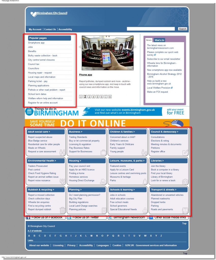
We deviate slightly from literal tasks in areas such as council tax – whilst a task might be defined as ‘paying your council tax’, we know from our own statistics that a sizeable number of website visitors are also interested in other council tax-related tasks (reporting a change in circumstances, applying for council tax benefit, etc) so it makes sense to lead visitors from the home page to the council tax landing page and let them choose their own task from there.
On our proposed interim layout we retain that list of top popular pages on the left of the home page, and the service top tasks are moved to the new segmentation landing pages, and also to megamenus as part of the menu bars on the top row. We’ll clearly need to user test these customer tasks to ensure they’re as obvious to complete as we’d assume they would be.
It would be easy to stop there and think job done, safe in the knowledge that we’ve catered for that majority (the notional 80%) of customers who are after that minority (the notional 20%) of the content. But don’t forget, one of the intended outcomes of this project is to ensure that niche content is just as easy to find as majority content, without the presence of both interfering with each other. If we make it incredibly easy to report a missed bin collection, but it’s near impossible for somebody to find information about the city’s Archaeology Strategy (highly niche content, maybe, but essential reading for any organisation planning a multi-million pound building development), or Strategy for Economic Growth (again niche, but important for anybody responsible for allocating multi-millions of pounds of investment funding in the city) then by our own objectives we will have failed.
So yes, we’ll be testing user-testing our top tasks to ensure people can complete them – but we’ll be treating these as control groups; if these tests fail then there will be something catastrophic in our interaction design.
We will also need to user test the journeys to the niche pages above – and, indeed, we need to ensure that middle ground content – say, school admissions procedures, the noise nuisance report page, and how to make a freedom of information request, is also properly user tested, to ensure those tasks are also easy to complete, and that making those tasks easy to complete doesn’t make it difficult to complete the top tasks.